I’m very excited to announce a new project that I collaborated on and was given this fantastic opportunity by The Signe and Ane Gyllenberg Foundation and Villa Gyllenberg and Chief Curator, Lotta Nylund and that my dear friend Marja Lahelma, Art historian and Curator of this exhibition recommended me to and that opens in Helsinki, Finland on February 14th 2024 at the Villa Gyllenberg; Schjerfbeck and Fashion- Art and Costume History 1880-1950.
https://www.villagyllenberg.fi/en/exhibitions/schjerfbeck-muoti-taidetta-ja-pukuhistoriaa-1880-1950-14-2-9-6-2024
It is about the Finnish National Treasure and artist Helene Schjerfbeck amongst other Finnish artists and her work and her particular vision about women’s fashions of the era. Also my vision is brought to life. Her work was also exhibited at a major exhibition at The Royal Academy of Arts, London in 2019.
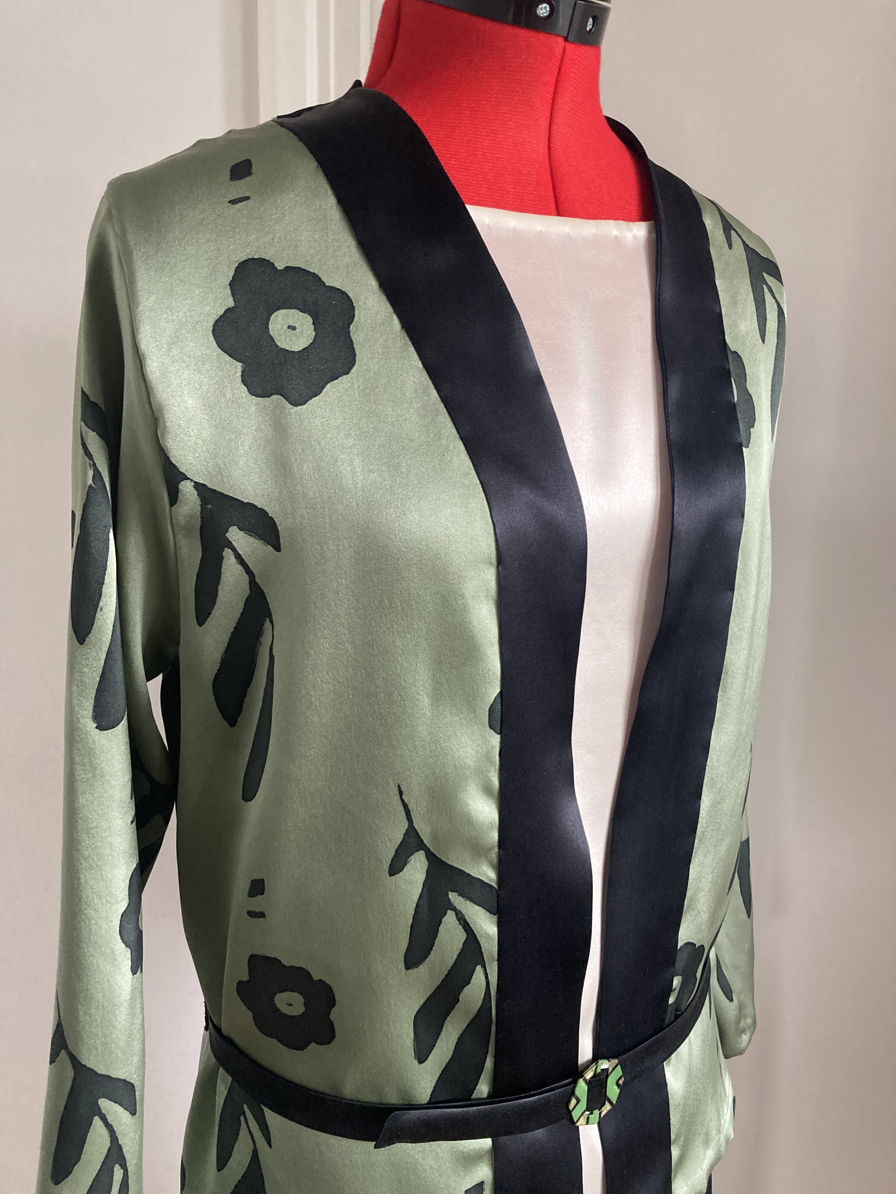
I was commissioned to design and make a costume based on one of Schjerfbeck’ s paintings from the Villa Gyllenberg’ s collection of the artist’s work, « Tumma Nainen » (« Dark Lady », 1929) and I also collaborated in the exhibition catalogue with an article on womens fashions based on her paintings.

I have learnt a few new skills on the way too, like hand painting silk. And imagining what the artist may have thought the clothes looked like. Schjerfbeck used to portray the ladies in her paintings in the latest Parisian fashions, mostly product of her own imagination as usually the models did wear rather old fashioned clothing. She was very interested in French fashions of the era and this comes through in her art. It also influenced my design process with the style, silhouette and era research.
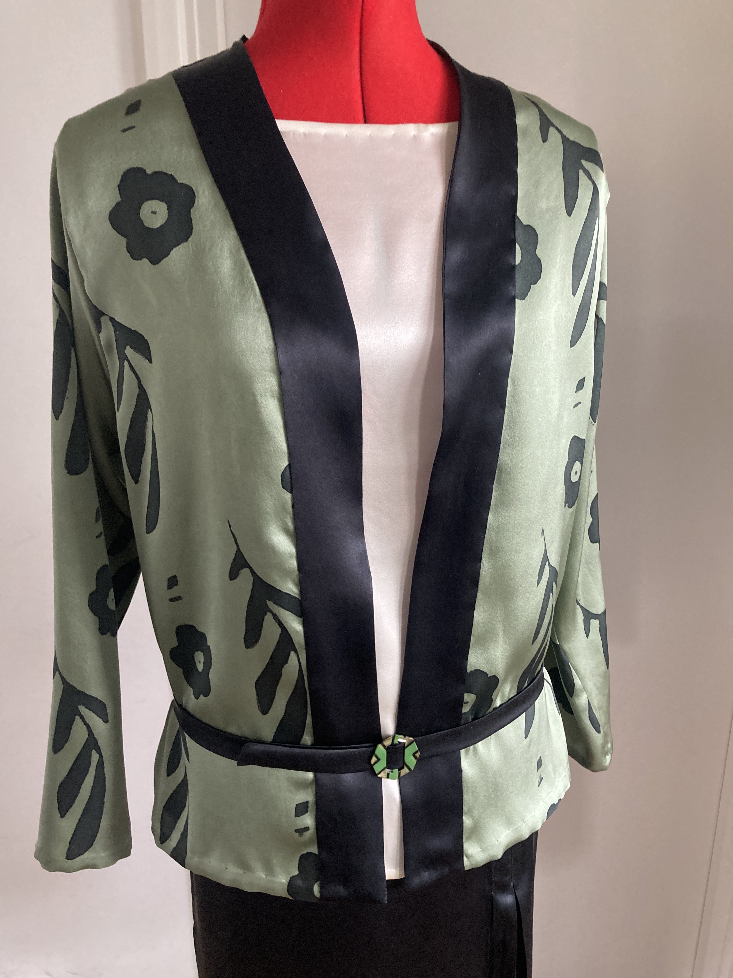
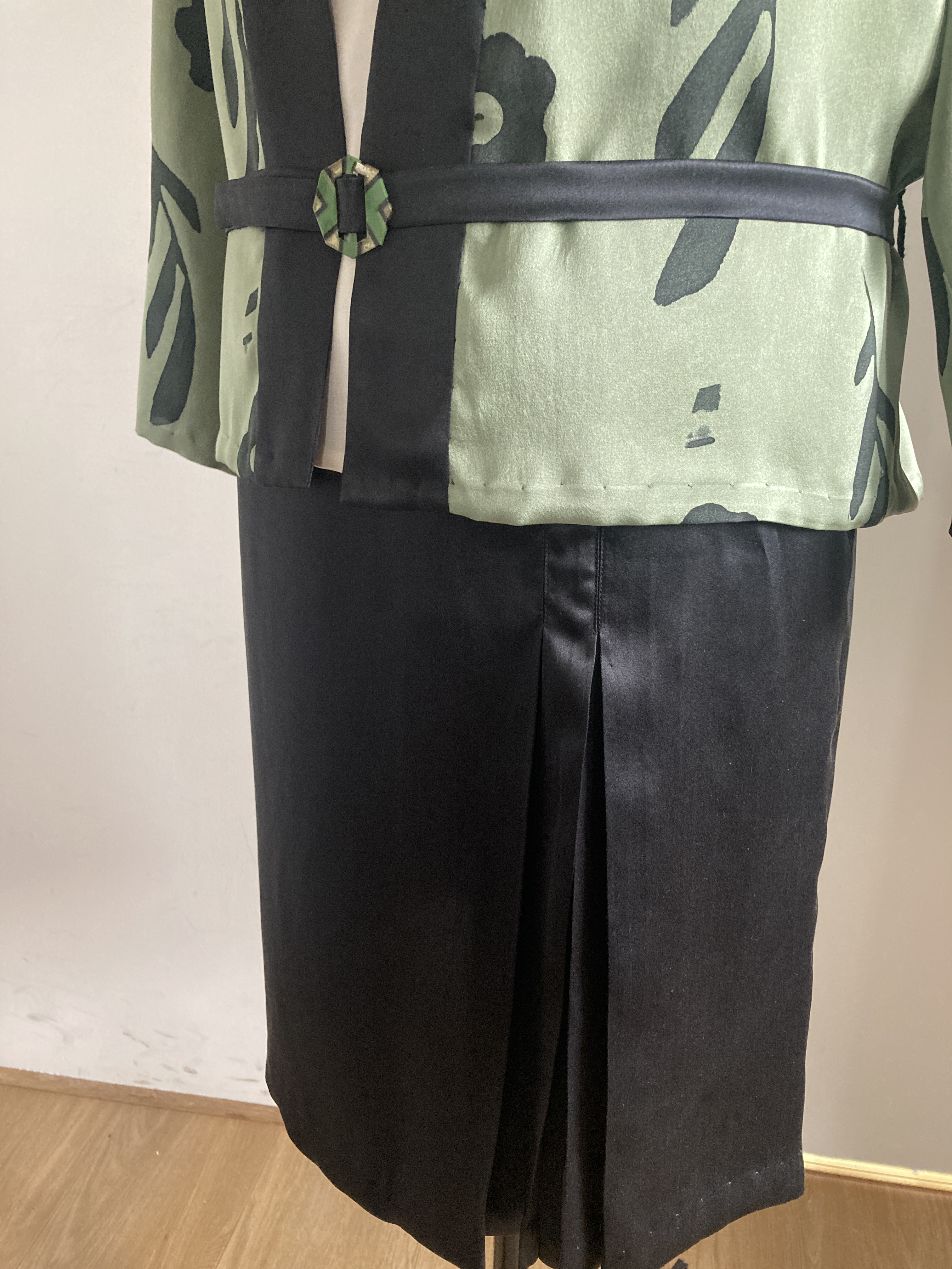
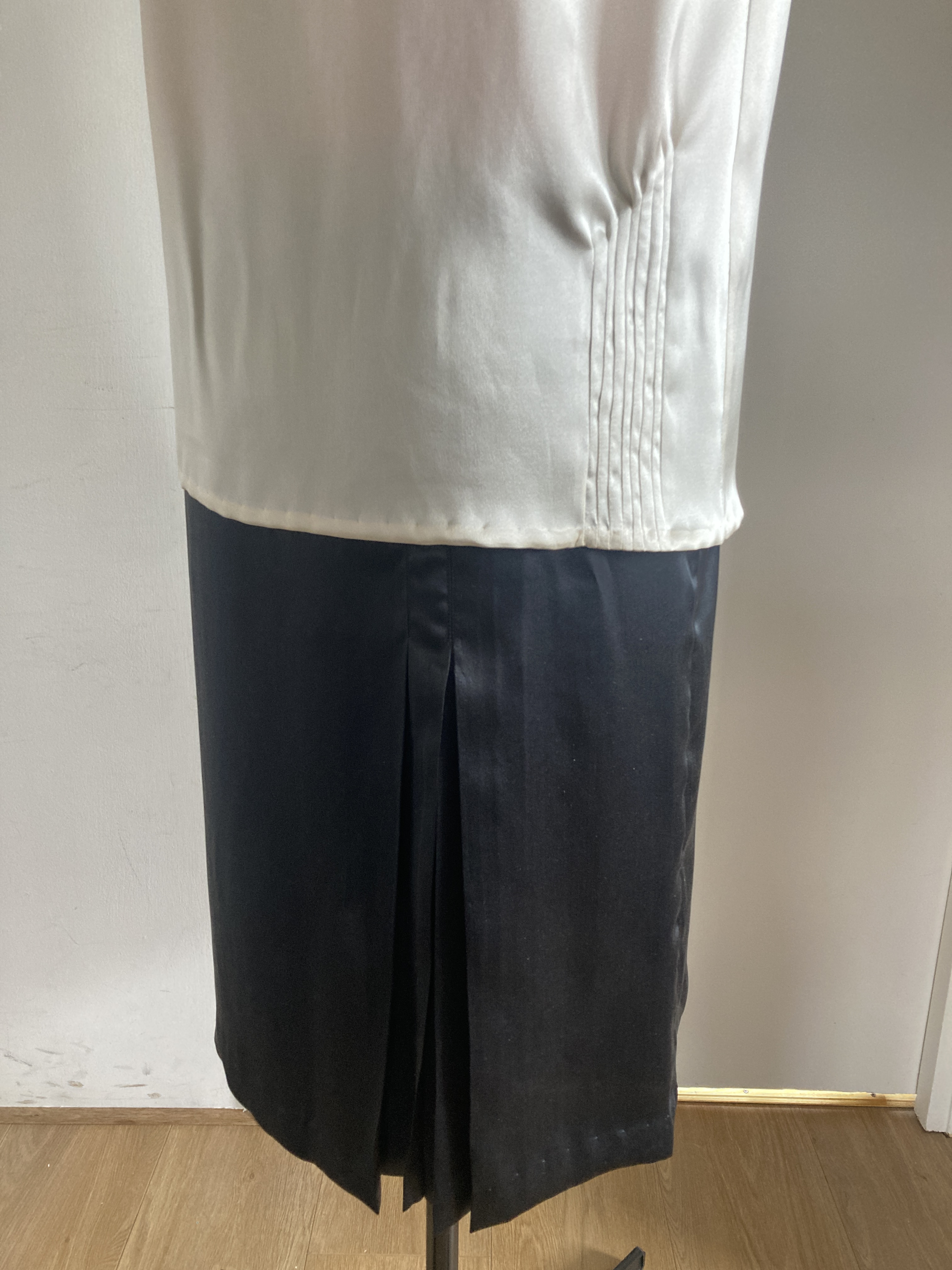
This painting is from 1929 and also a homage to Chanel, who was a pioneer in dressing the new modern woman, in her comfortable chic clothing.
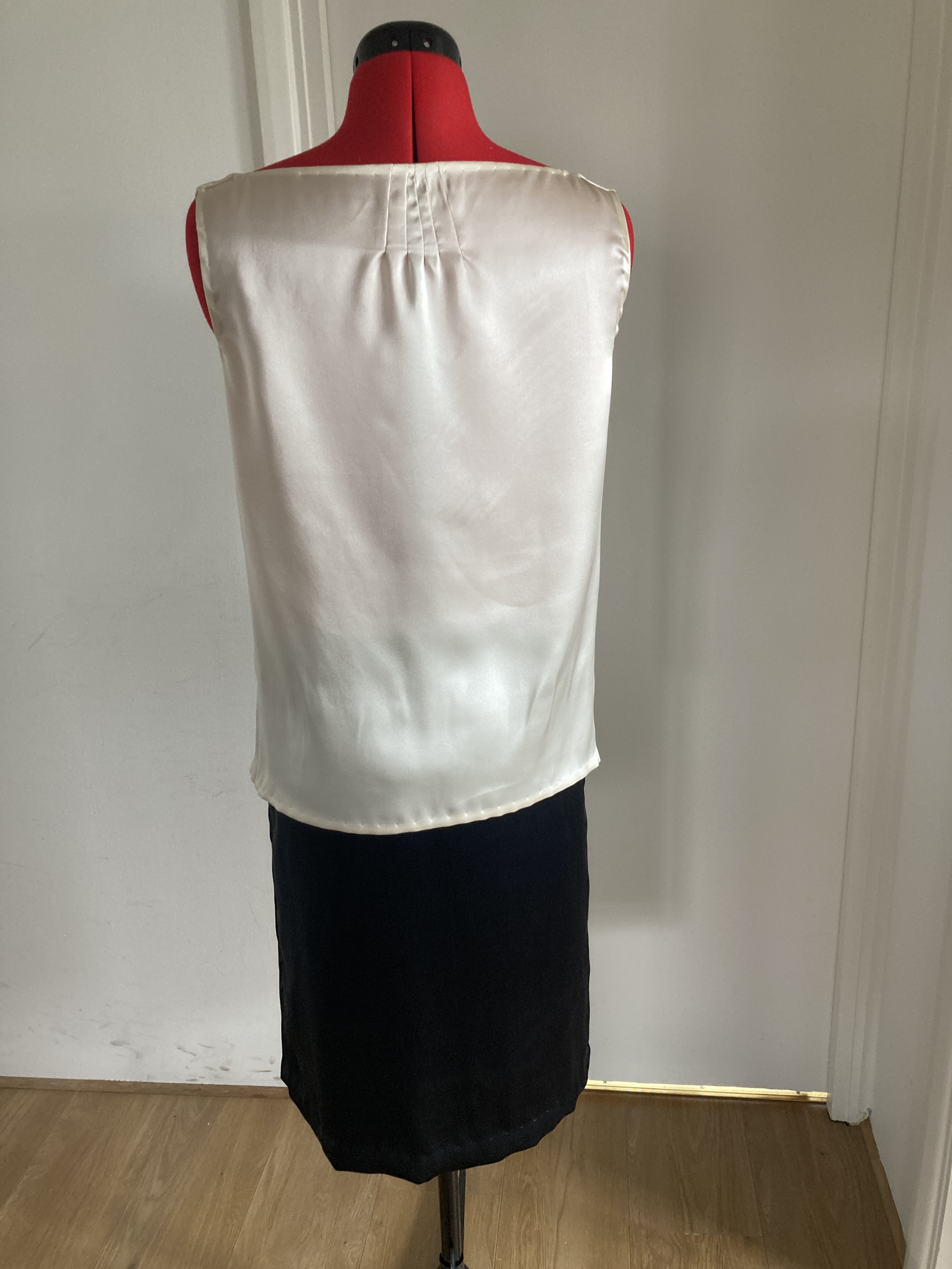
When it came to the process of making this outfit, I was thinking in the very popular silk crepe and rayon that was introduced circa 1924 and that became a staple fabric in the 1930s. For this one I opted for silk crepe.
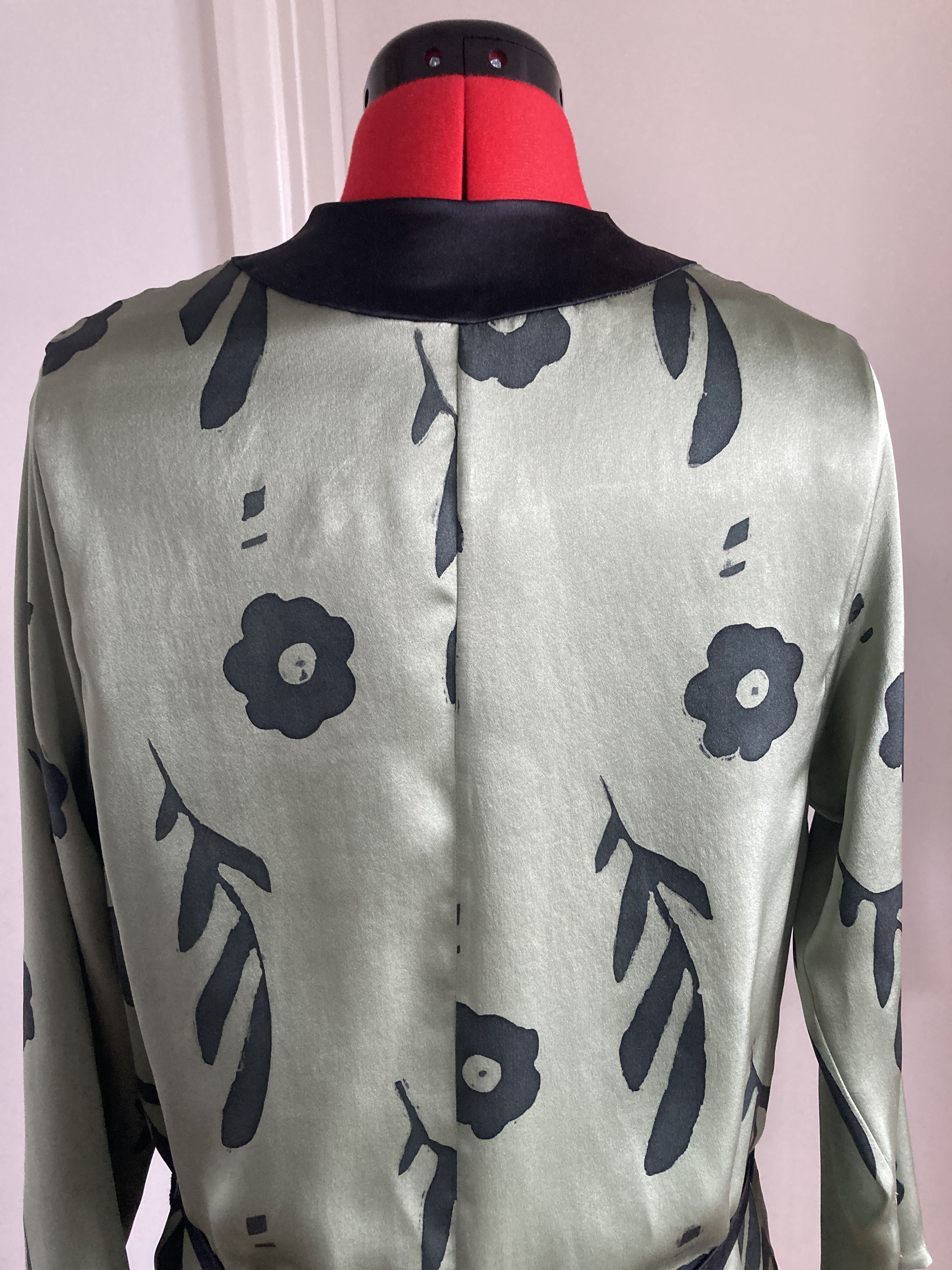
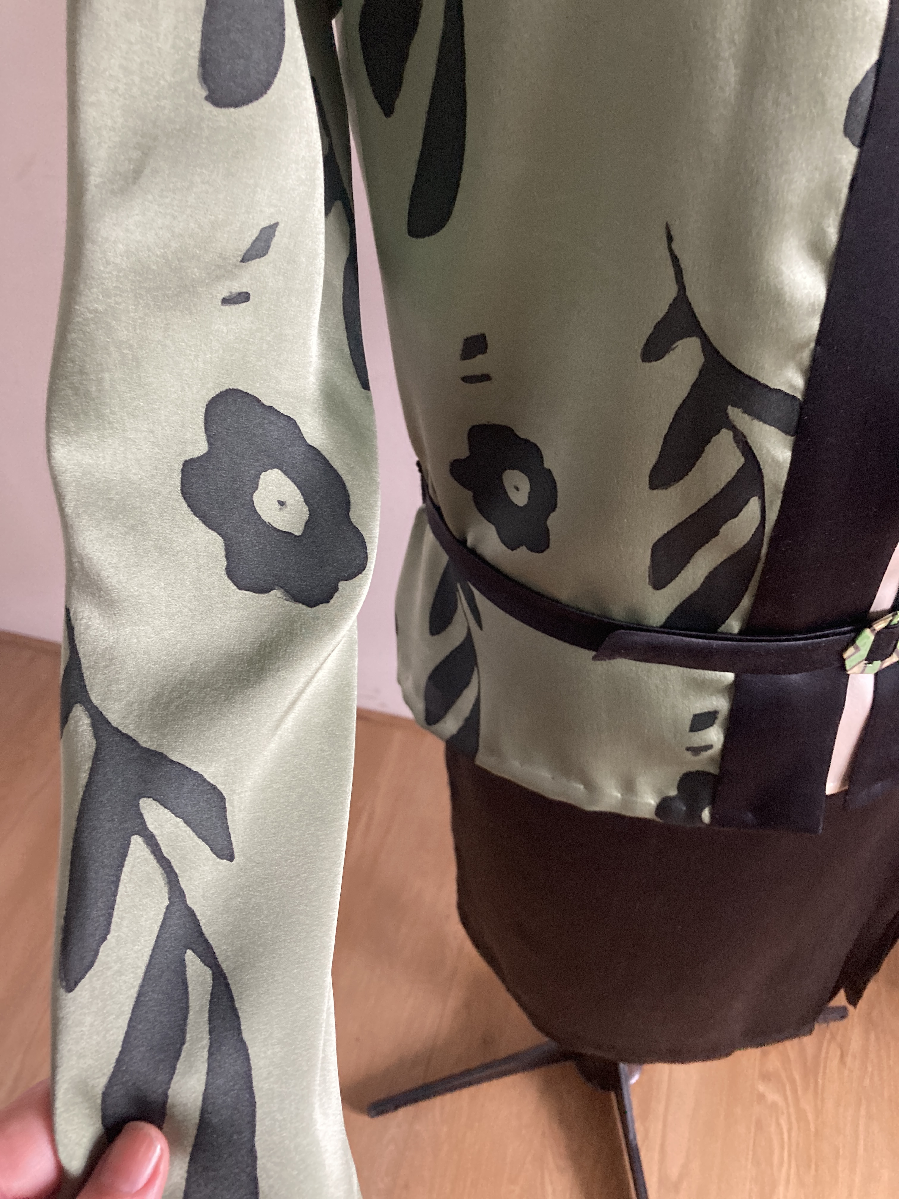
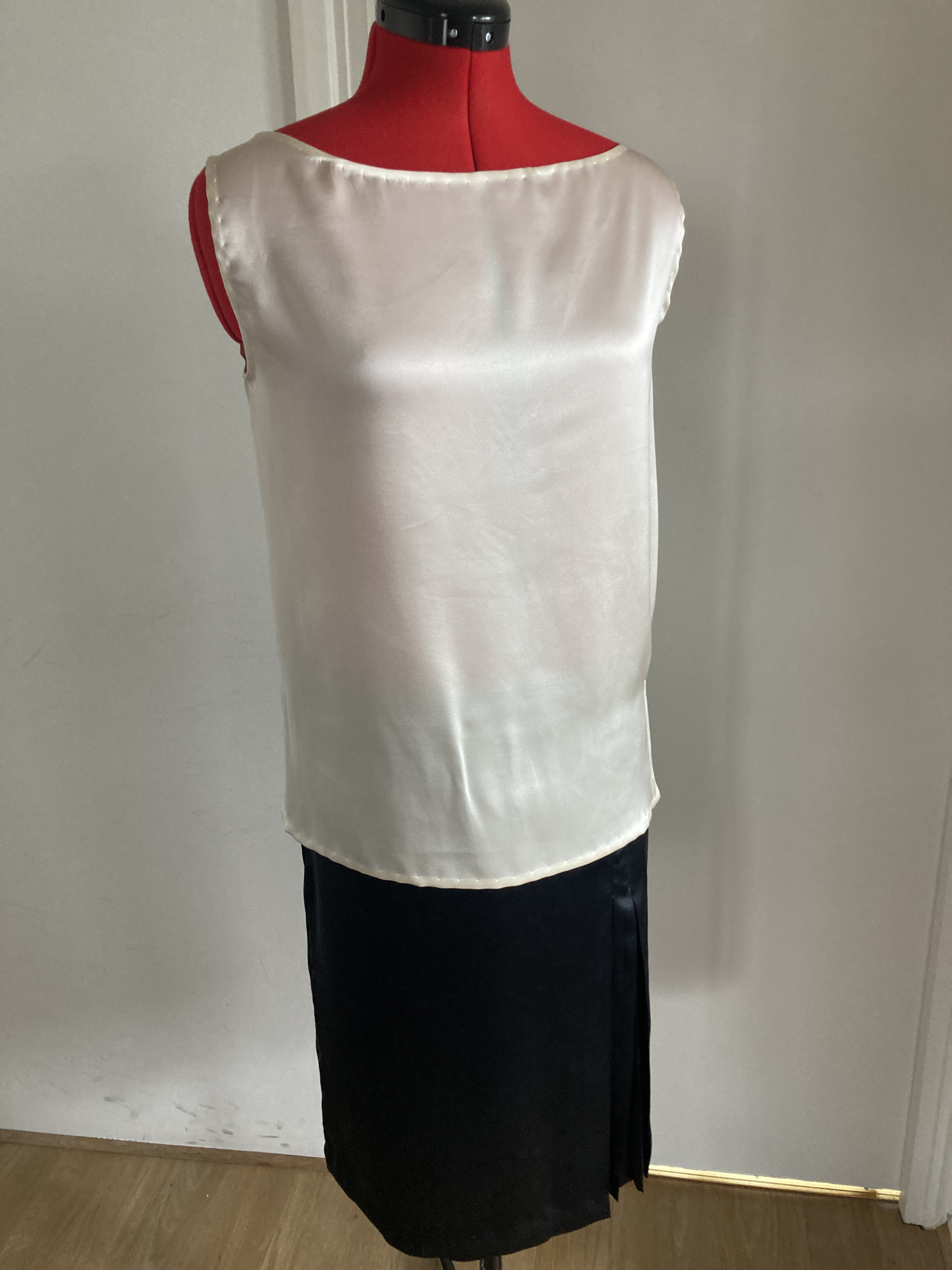
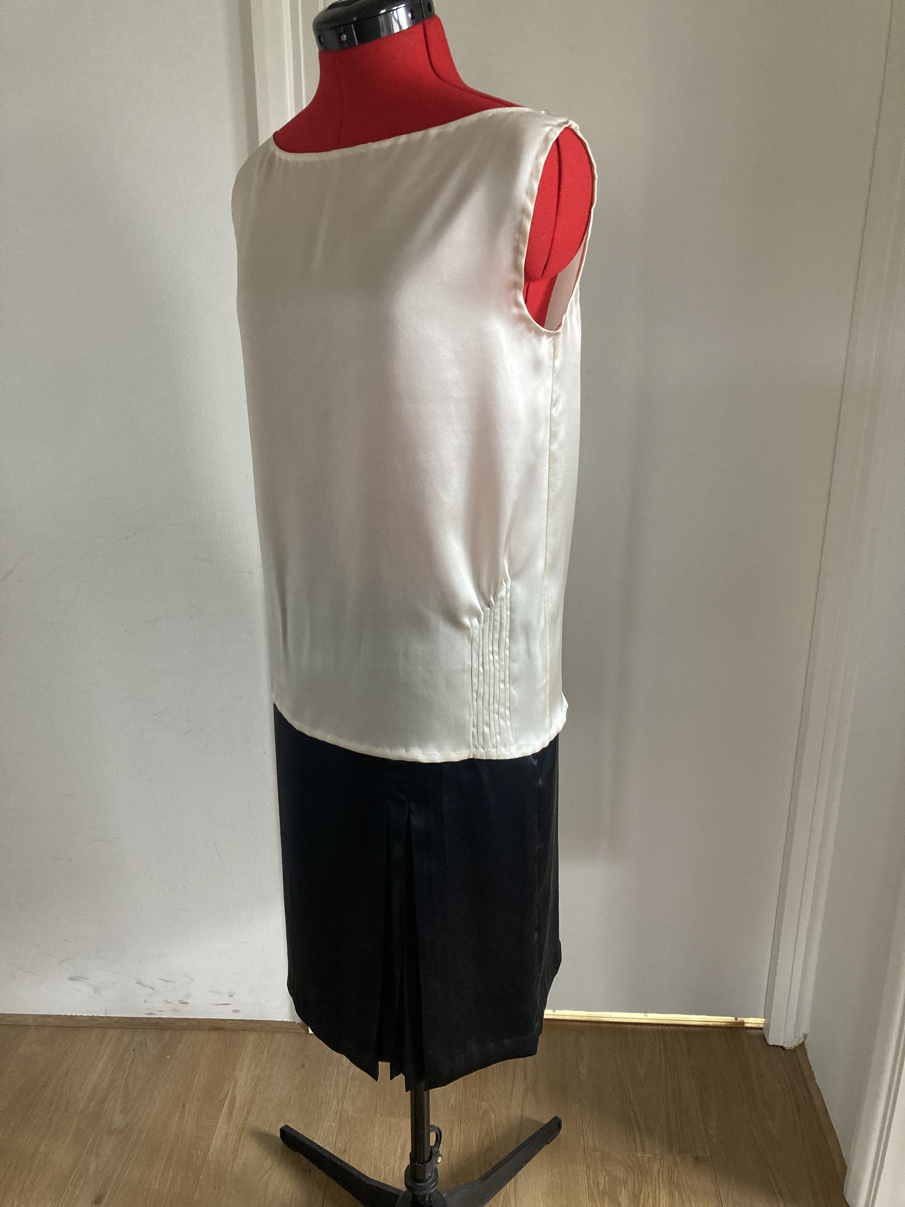
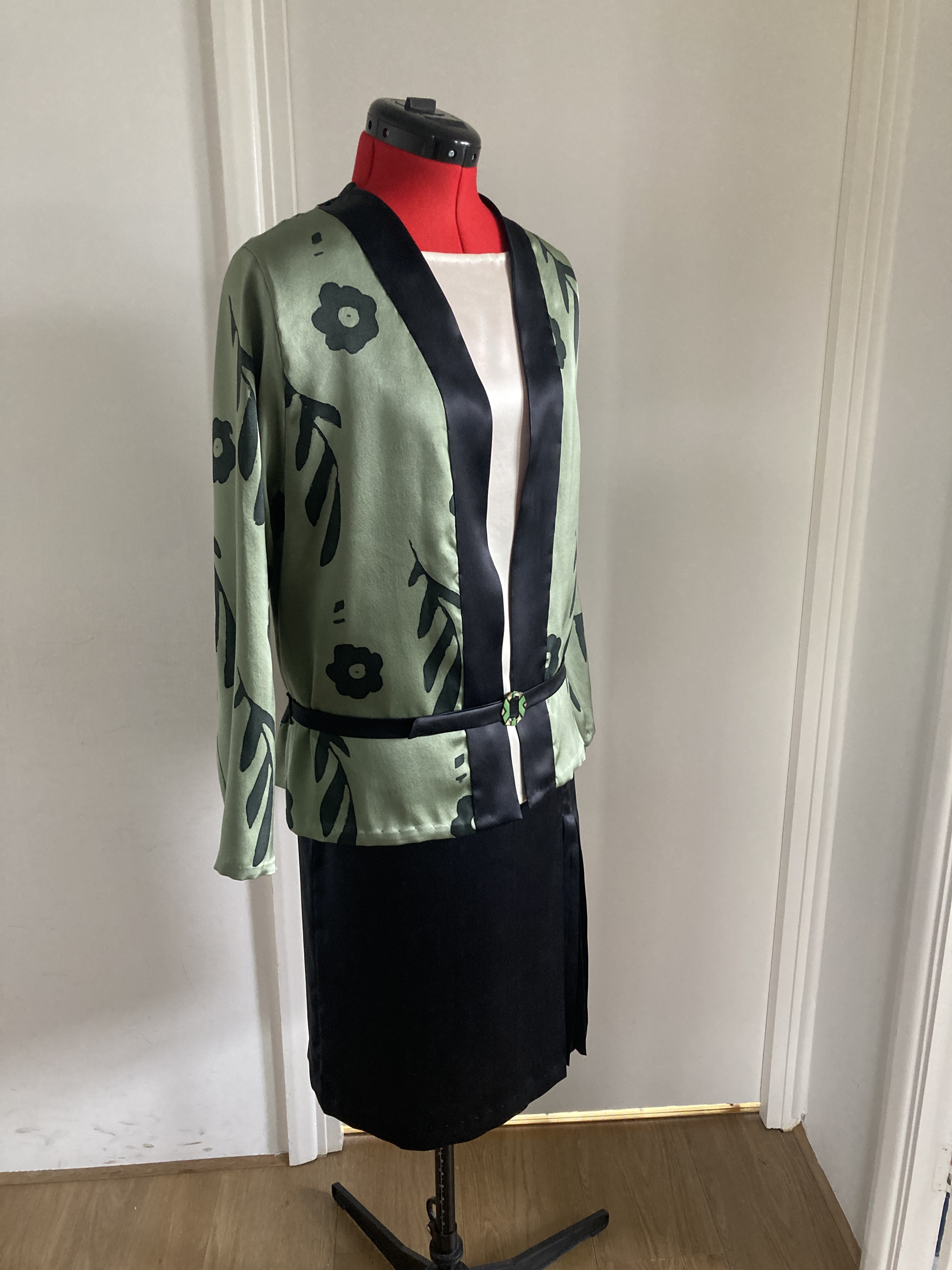
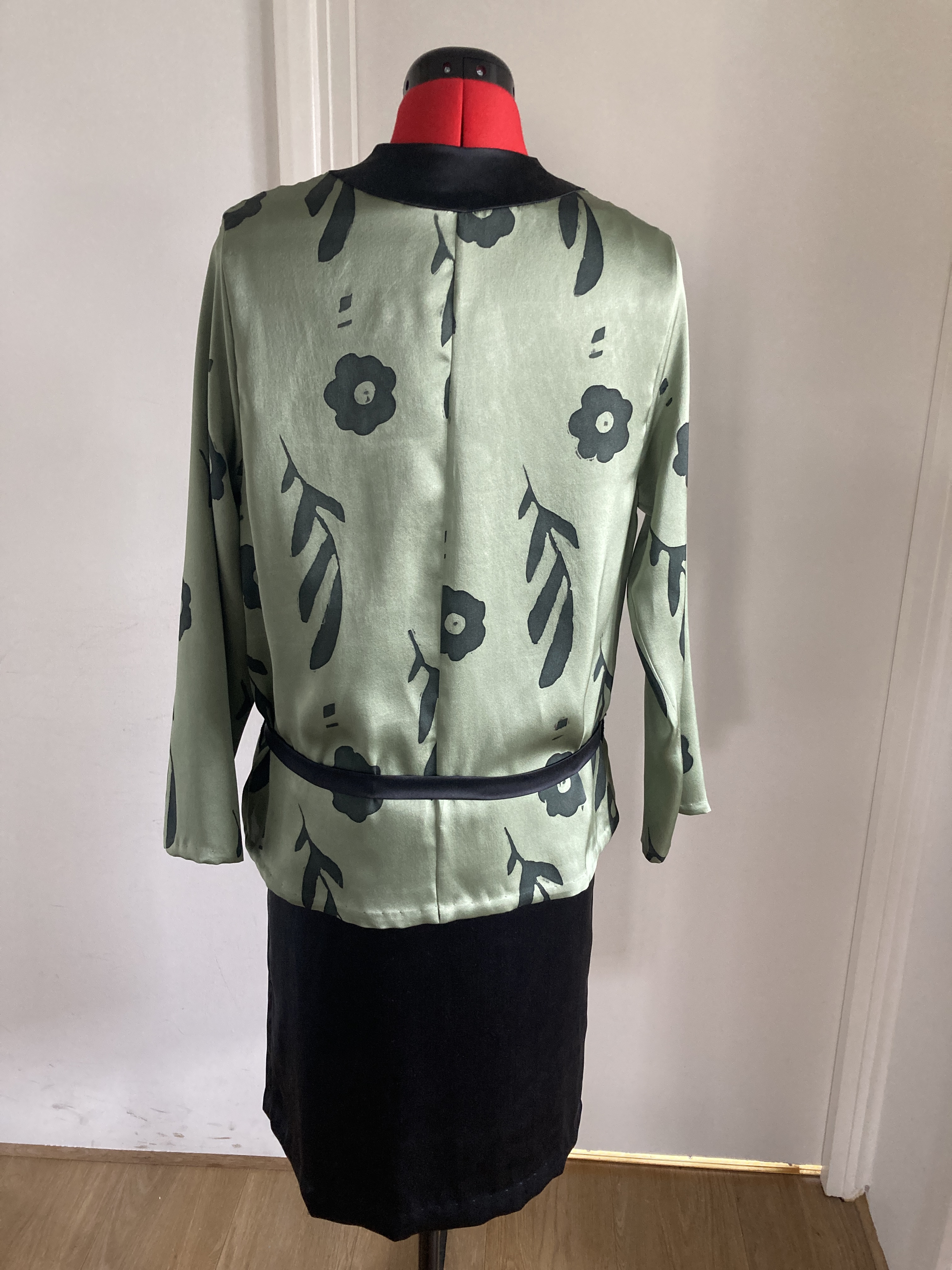
It is a three piece outfit with the very popular cream coloured sleeveless blouse, a black skirt which is a homage to Chanel, with the inverted pleat that she invented in 1926, and a kimono style jacket, with a handcrafted design based on screen printing that became very popular in the 1920s and inspired by the painting. I did a few sketches and this one was chosen in the end.

The jacket especially posed a few challenges. I had the original idea of having the design printed on the vintage shade of olive green silk crepe that I had sourced from silk manufacturers in Gloucestershire but having contacted couple of printing companies, I was told that they would only print on white/natural fabric of their own and the background colour would have to be matched to that of the green silk I had. I thought the process a bit too modern for this particular project. And also I would have had to line it, which I didn’t want to do.
I ordered a colour chart from one of the companies and, surprisingly enough none of the shades matched that of my existing fabric. I could have made my custom colour and submitted it but decided against it and planned to use that green silk I had. There was also the option of silk screen printing, either by one of the companies or by myself, but time and budget restrictions went against it.
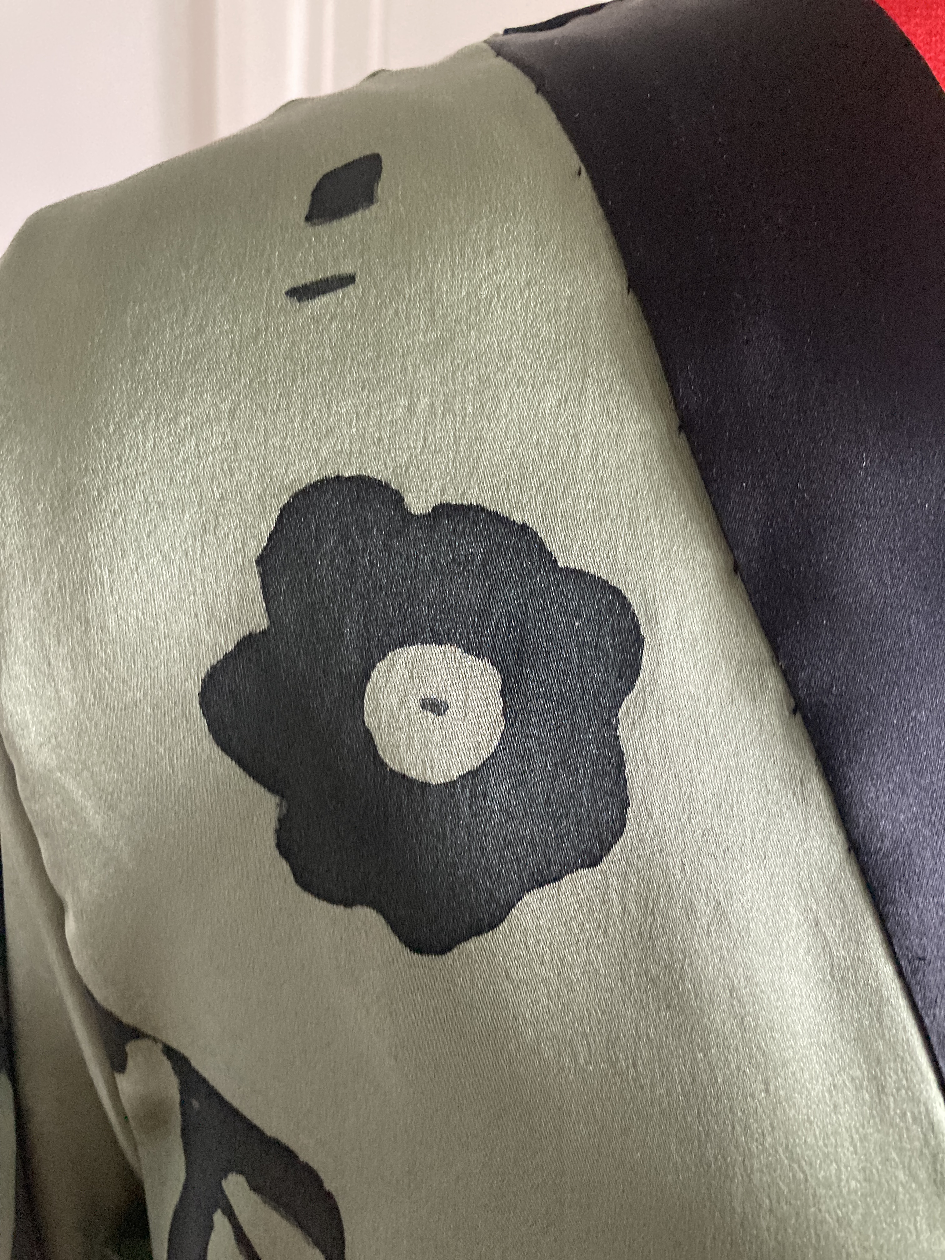
Which meant I would have to hand paint the silk myself. I have done fabric painting before, but never on silk, which is notoriously hard. I started by testing two silk paints, one unfortunately too shimmery and not the right texture and the other one, Marabu , which initially I had unsuccessful results with as it bled on the fabric, but then I discovered through an artist’s tutorial on YouTube how to use a clear contours liner by the same brand which effectively acted as a barrier inside the design and worked perfectly.
I had drawn my design on an A4 sheet of paper as a repetitive pattern, having studied the original painting’s print and the possible layout , also a rather tricky one as there isn’t much visible and I had to imagine what it may have looked like. Then I copied the design on a large stencil and used a cutter to get the outline for the painting. I then placed the stencil over an adjustable wooden frame, where I had laid and attached the silk tautly and secured it with masking tape. This was very important as otherwise the paint might run.
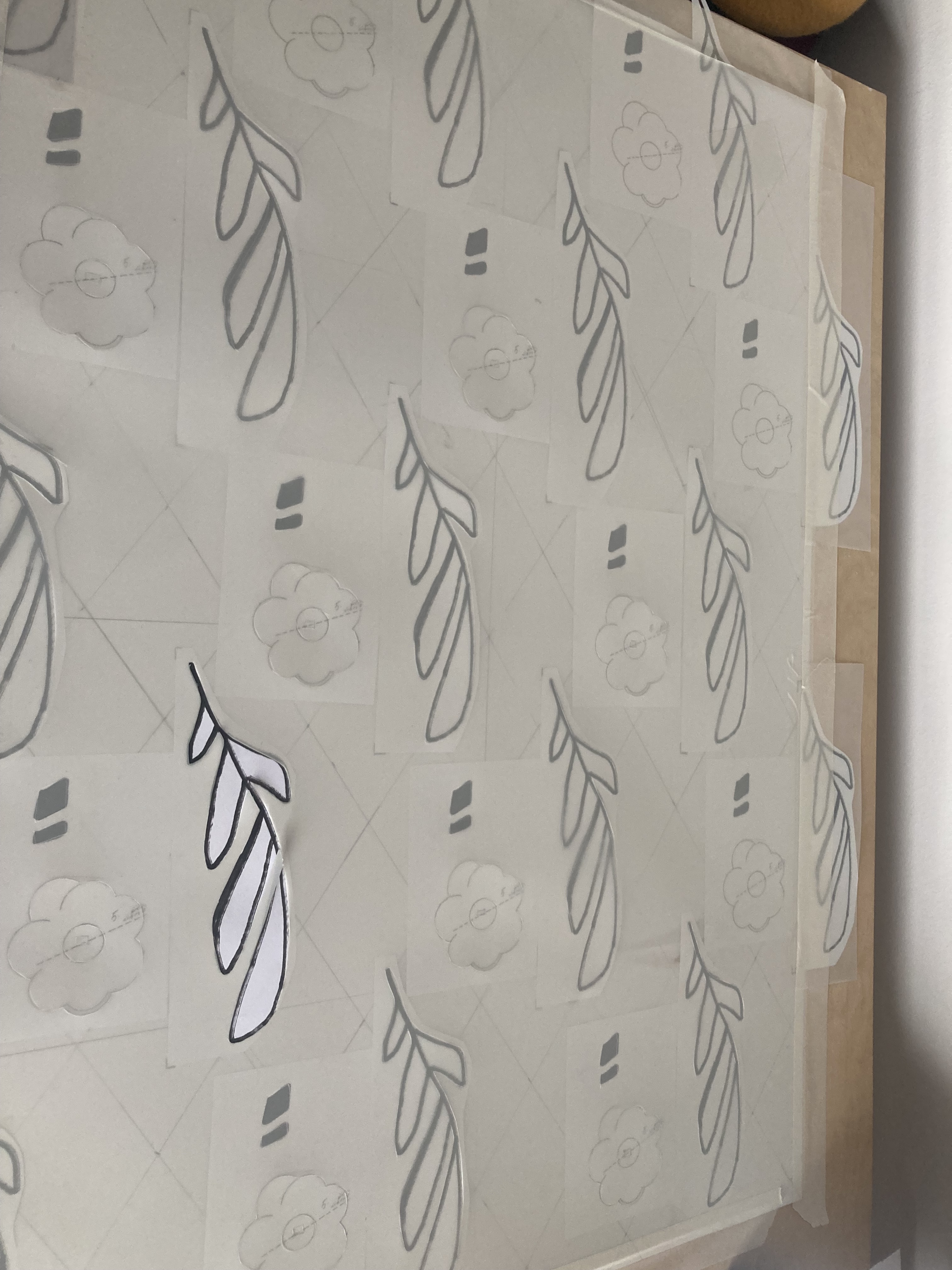
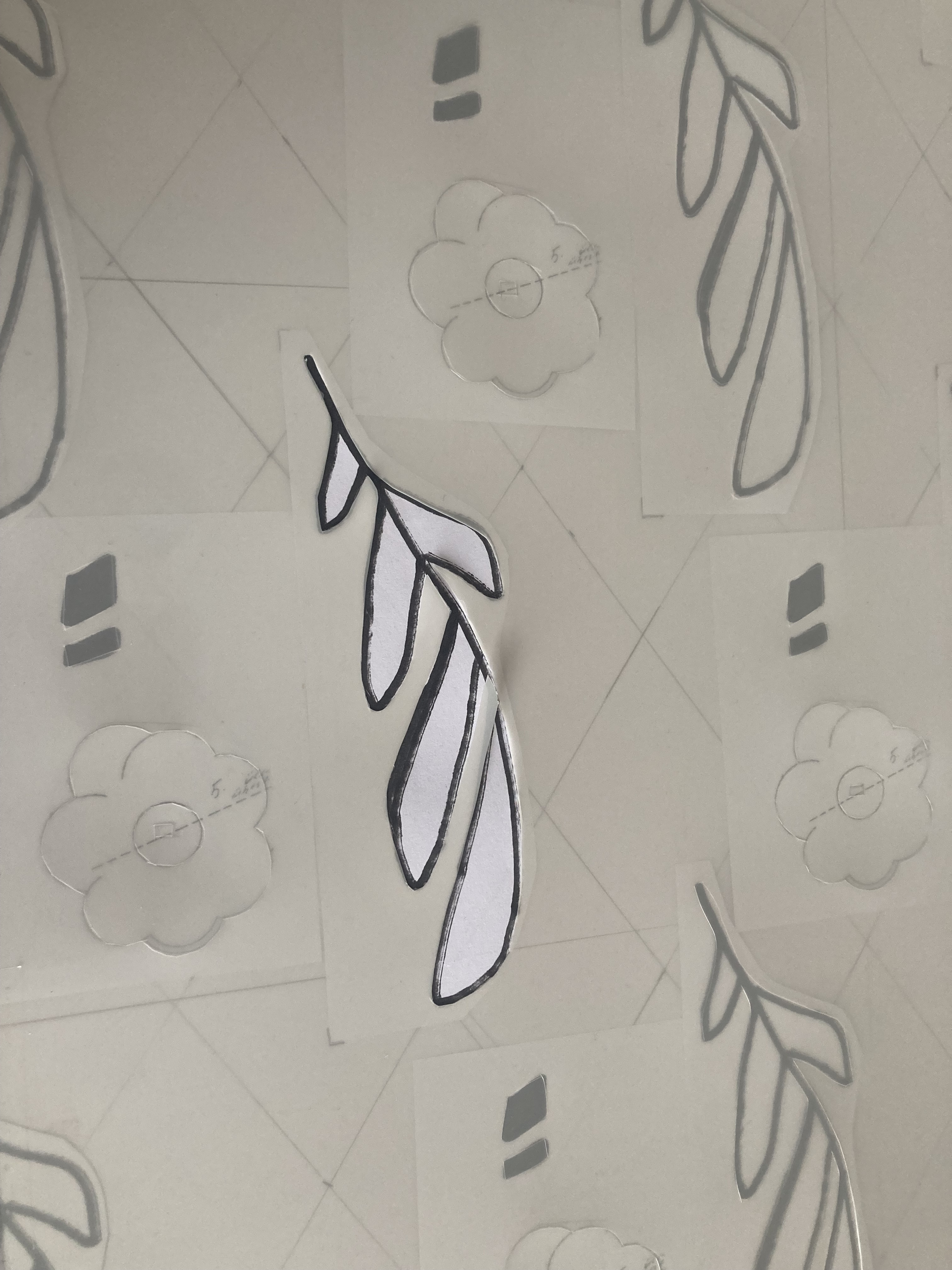
Then I carefully used the contours liner for each cut pattern, let the gel dry, removed the stencil and then applied the Marabu silk paint on each pattern with a fine brush, and as it is liquid, you didn’t need much as placing a little paint in the middle of the design, it would fill it naturally and stopped by the barrier. Magic!
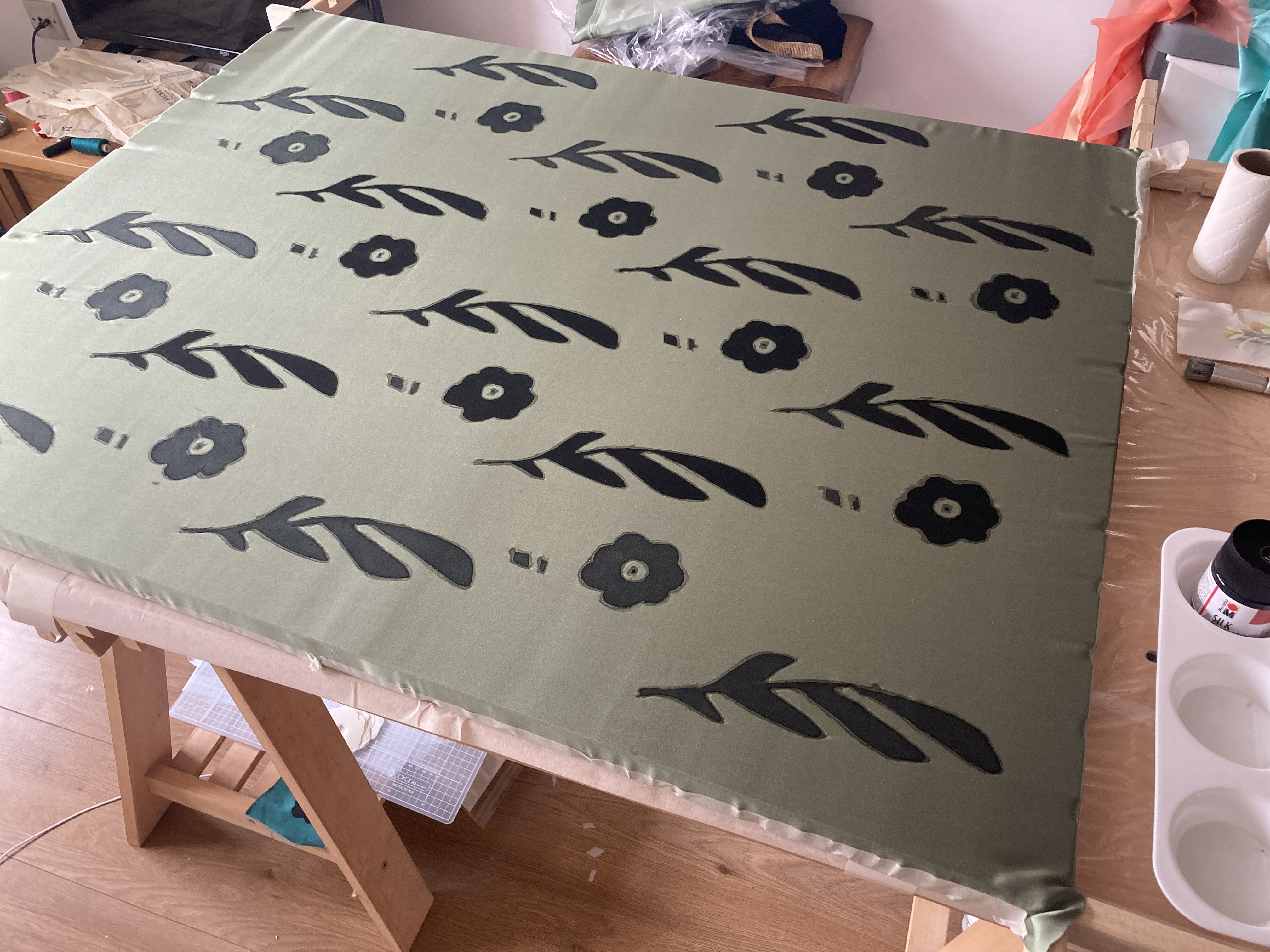

Then I let these dry, hand washed countour liner, let the fabric dry and then ironed it on the reverse of the design. Et voila!
I then repeated this process twice more, one for the front, one for the back and one for the sleeves of the jacket.
I had already designed and cut the pattern, adapted from a 1929 Parisian fashion magazine pattern, the same I had done with the skirt for the outfit.
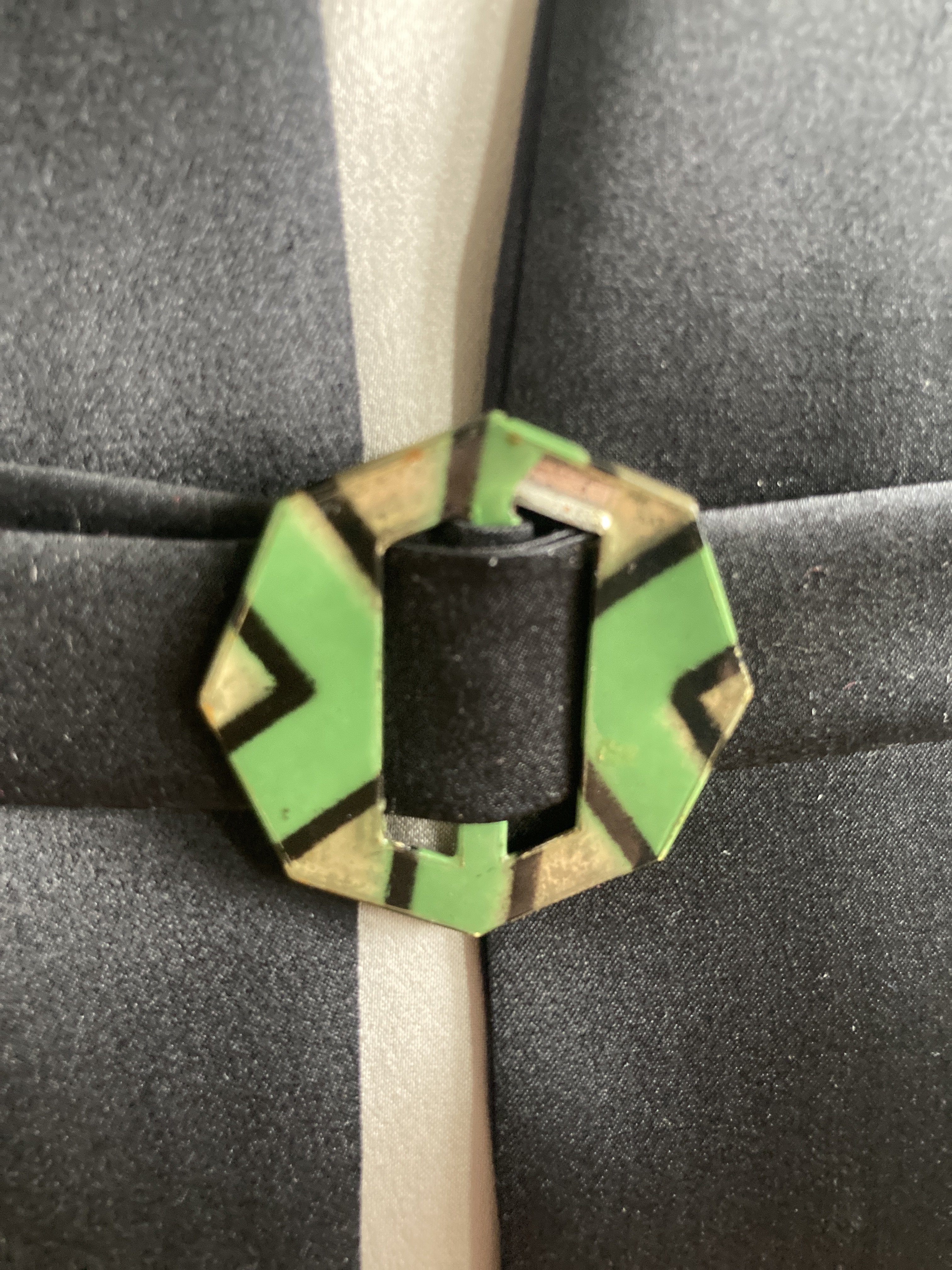
The belt features an original vintage celluloid buckle.


What have I learnt?
Well, something I could have had printed by someone else, and because of time and budget constraints, opened up new opportunities and skills, as having been able to hand paint the fabric as silk and block printing was very much of the time, and this was made by this method as it could have been done in the 1920s.
It also brought me closer to fashion designers I admire, like Coco Chanel ( and to whom the skirt is homage to), Sonia Delaunay, with her beautiful geometric designs, the imaginative and wonderful Elsa Schiaparelli, and Madeleine Vionnet, who introduced us the flattering bias cut.
All fabulous women in a Man’s world, ahead of their time.
